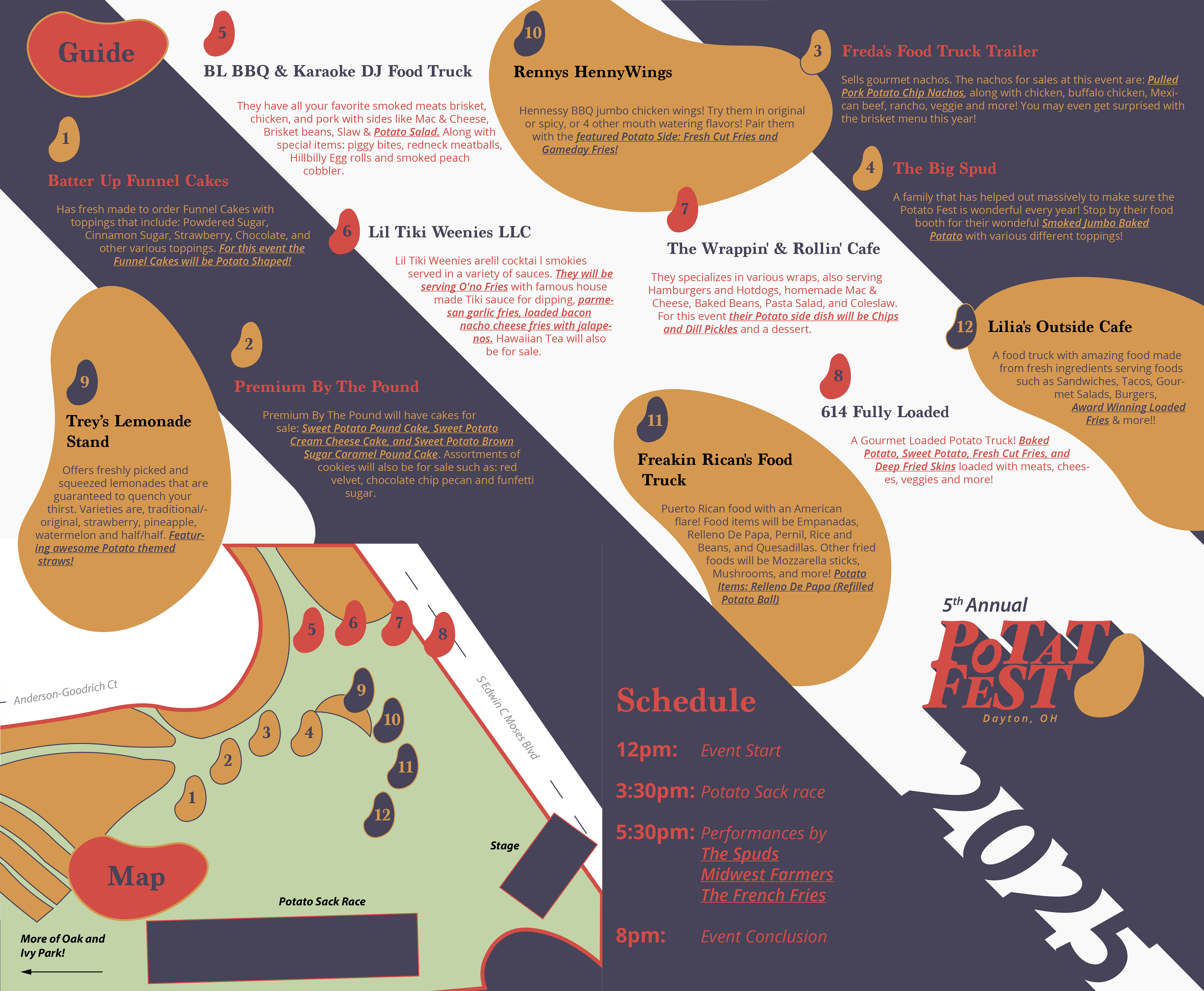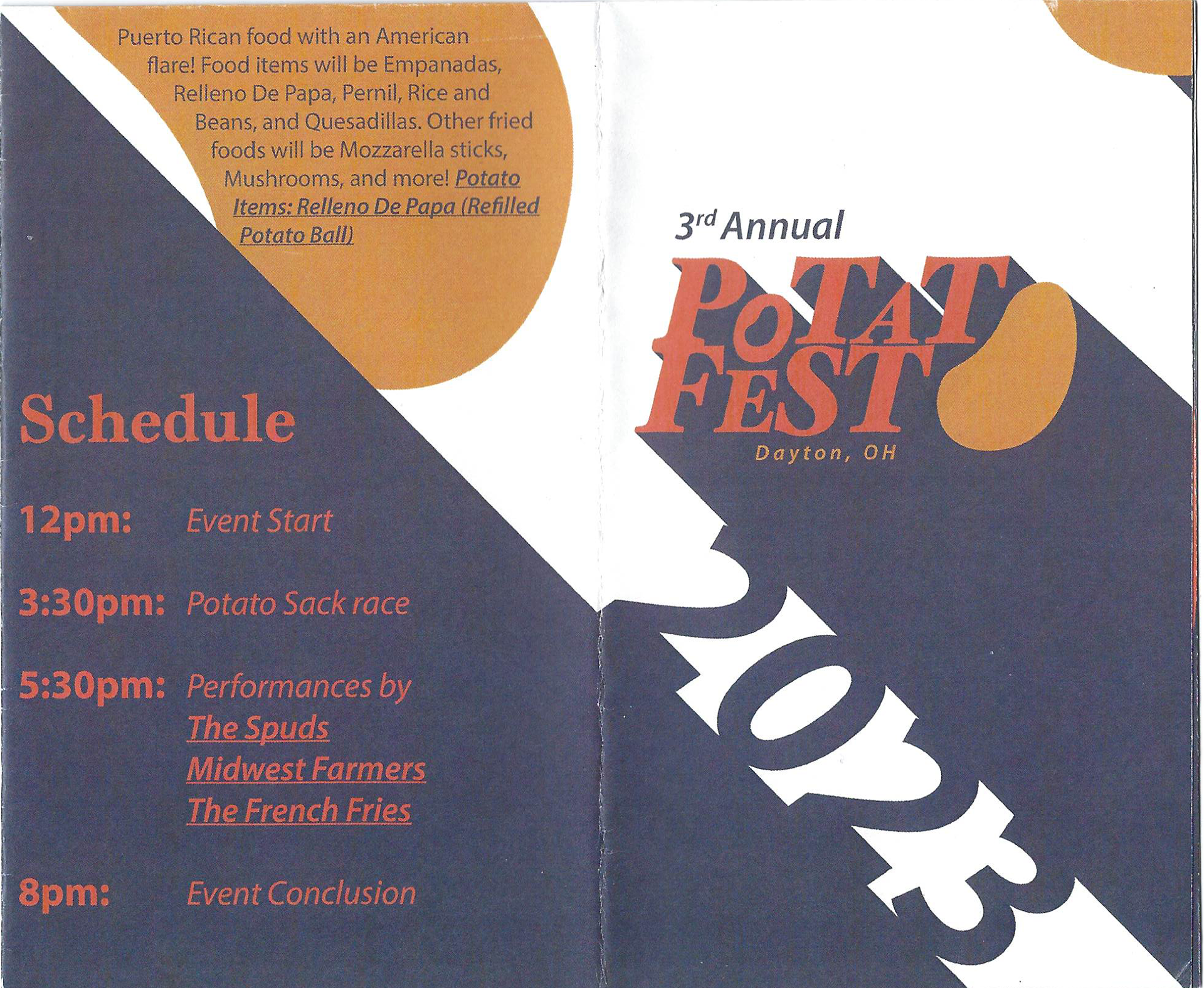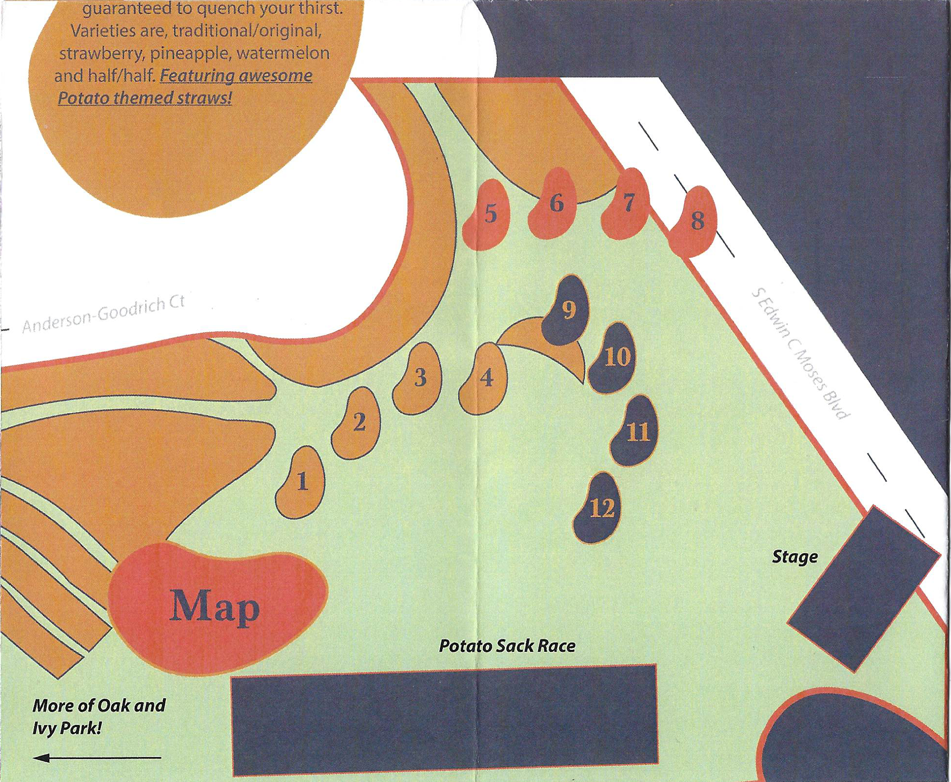
The Dayton Potato Fest is an annual festival held on the second weekend in August in the city of Dayton, OH since 2021 as a way to bring the city together after the pandemic. The festival is centered around potato dishes, food truck vendors, and different activities/entertainment to engage the community.
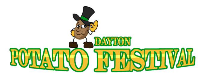
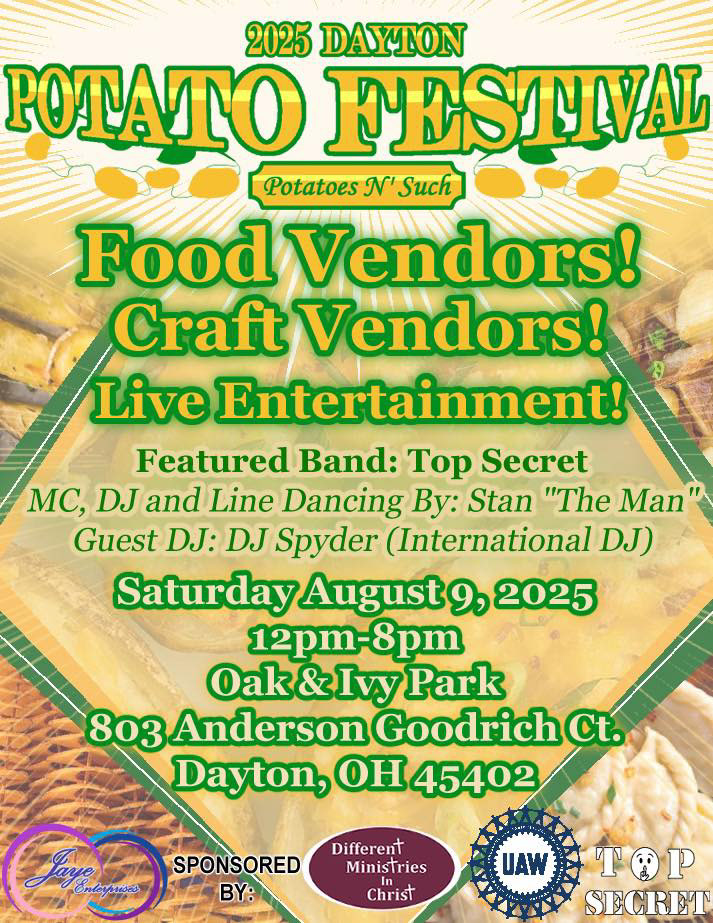
What is the current visual identity?
With the current branding, it is difficult to tell what the primary and secondary wordmarks or logos are, what the brand typefaces are, how color, image, and hierarchy are supposed to work.
What are the core values of this event?
Inclusion - The Potato Festival was created to unite the city after the Pandemic.
Variety - Food Trucks are brought in from all over that each have different ways to prepare potato dishes.
Entertainment - It's an 8 hour long community event with competitions, dancing, and live bands for the whole family.How do I visually show the familiarity of a local event? How do I make it fun and entertaining, something that the community and vendors will want to come back to every year? How do I ground this brand to make it more consistent across the board?
Sketches
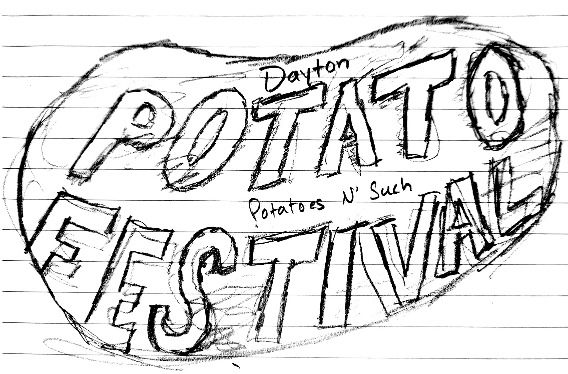
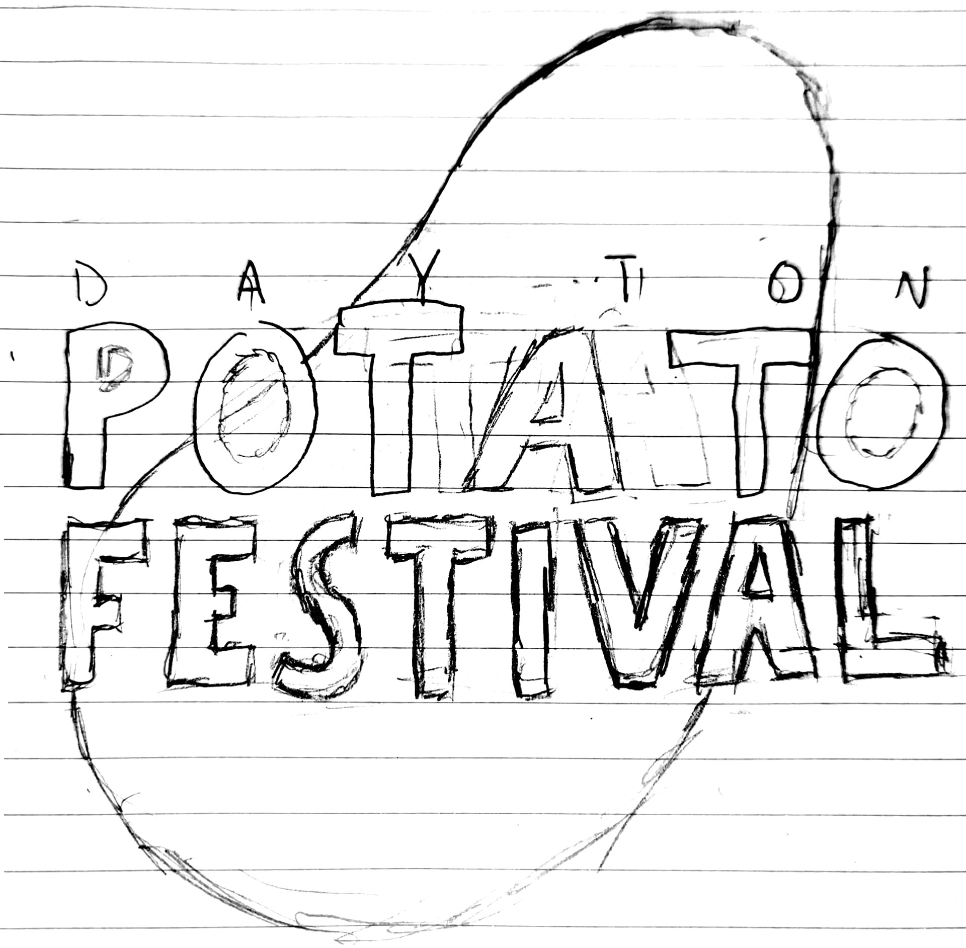
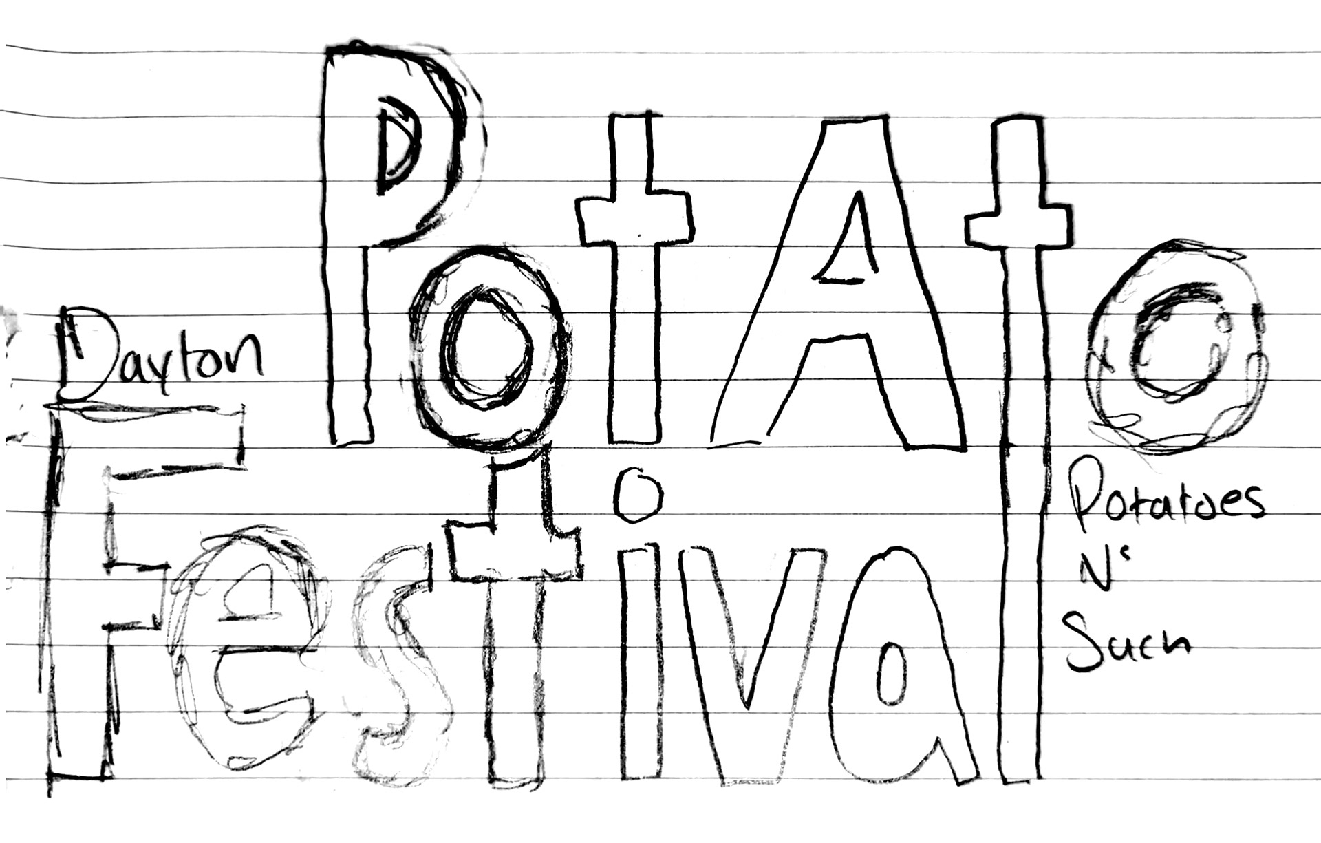
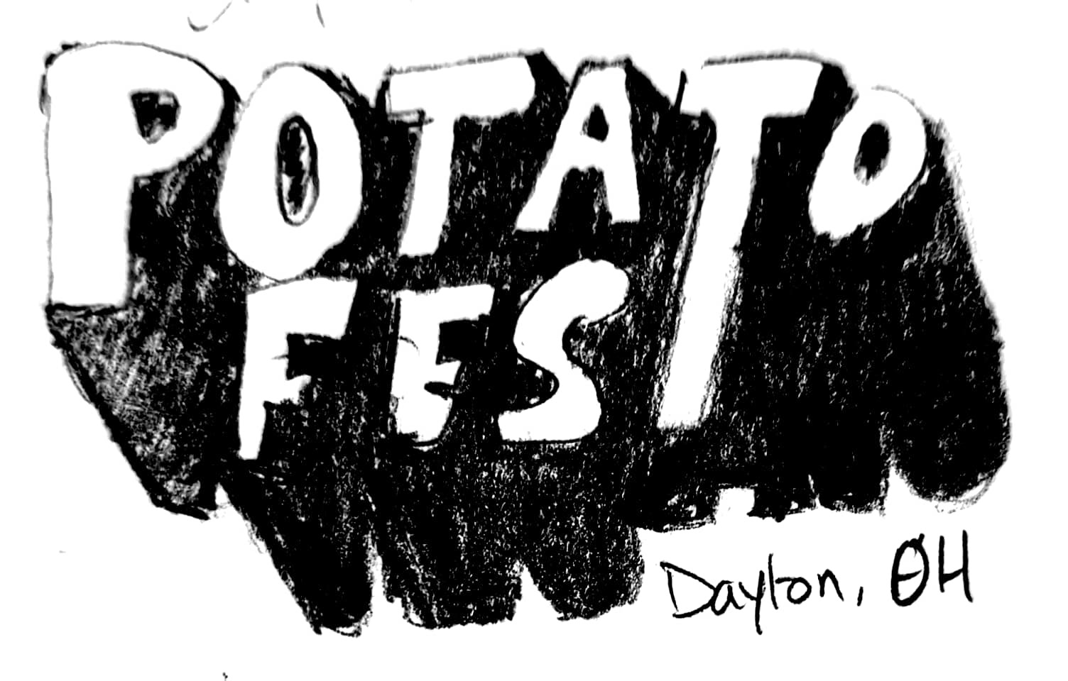
Initial digital sketches
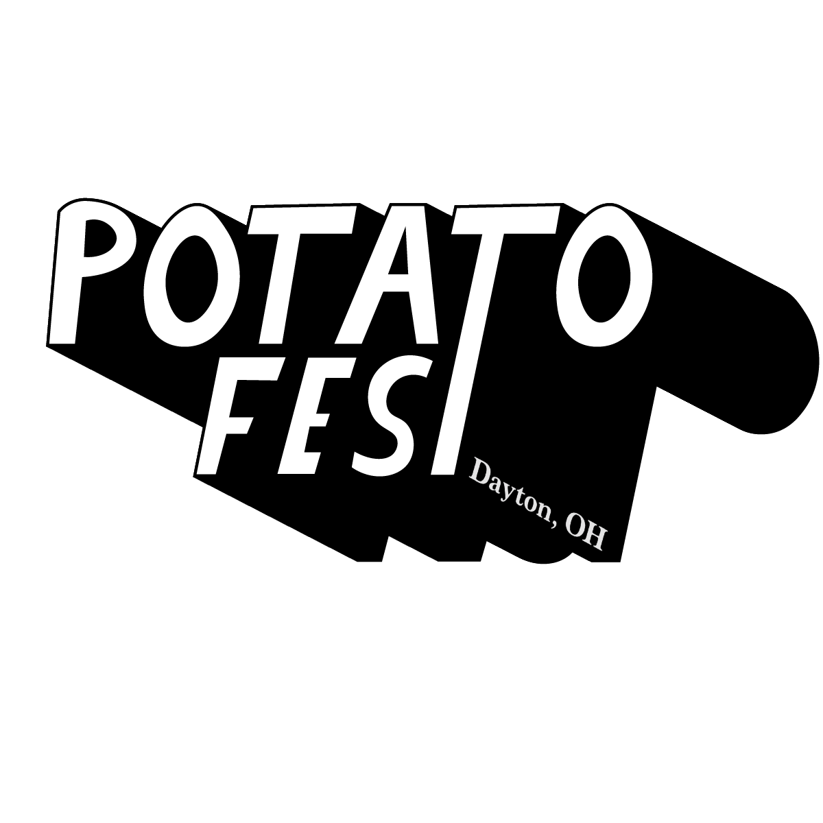
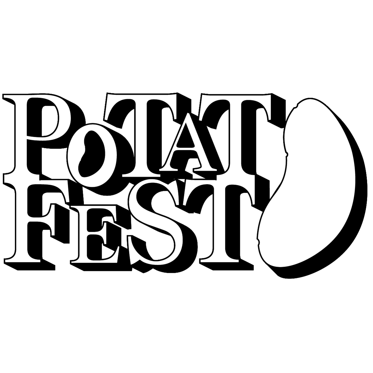
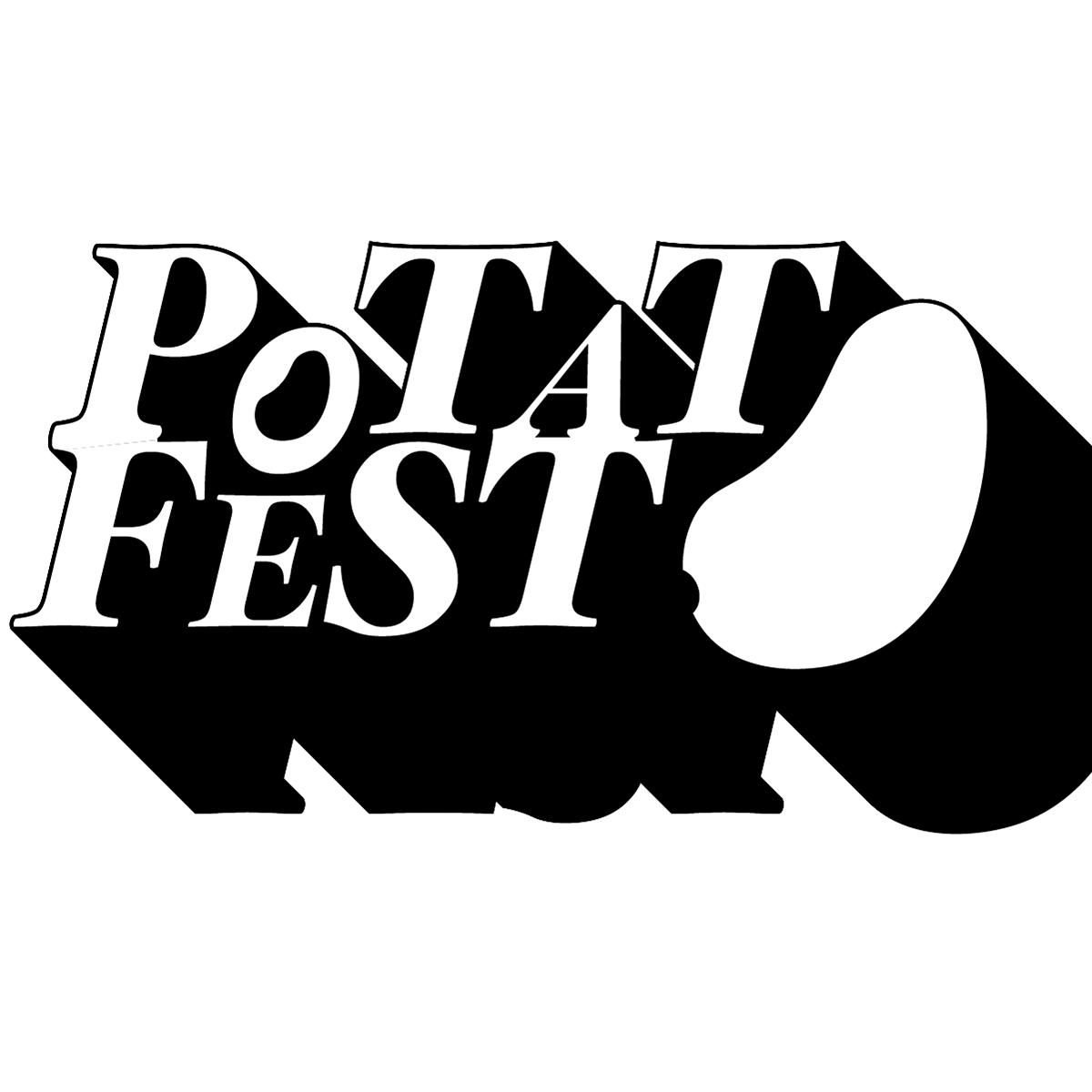
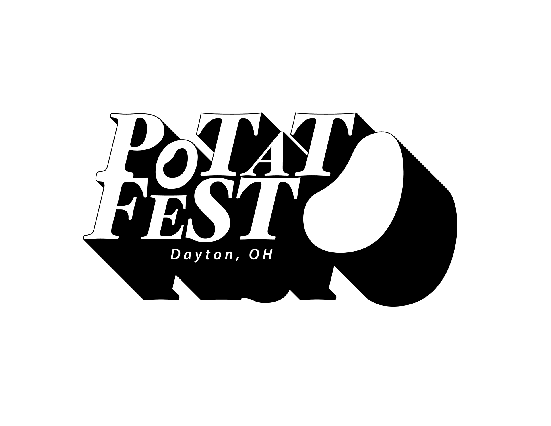
Final black and white logo
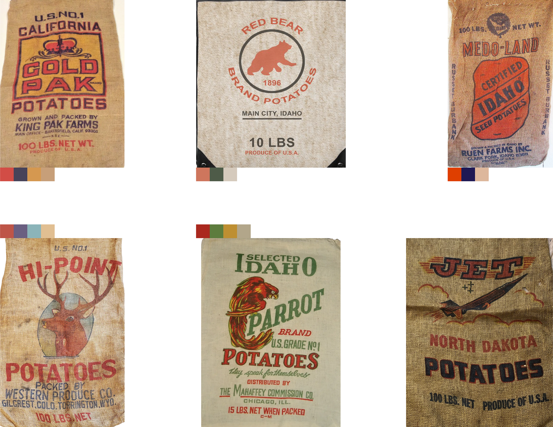
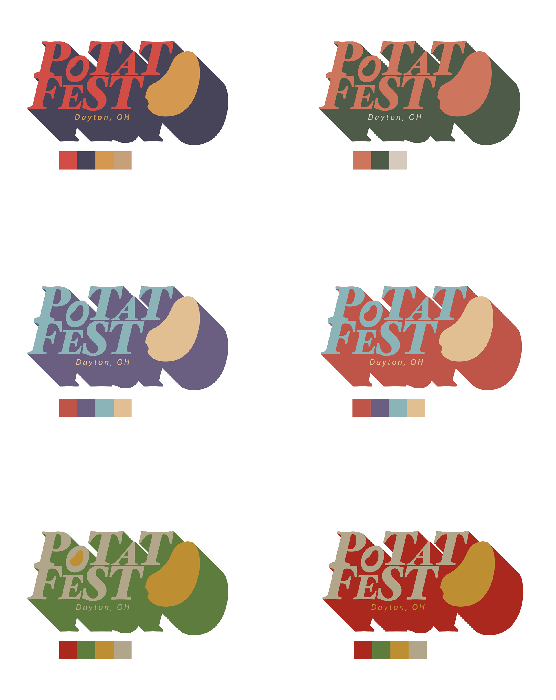
Color exploration
I drew color inspiration from potato sacks. I knew that the colors would have to be bold but still grounded, which is exactly what I was looking for.
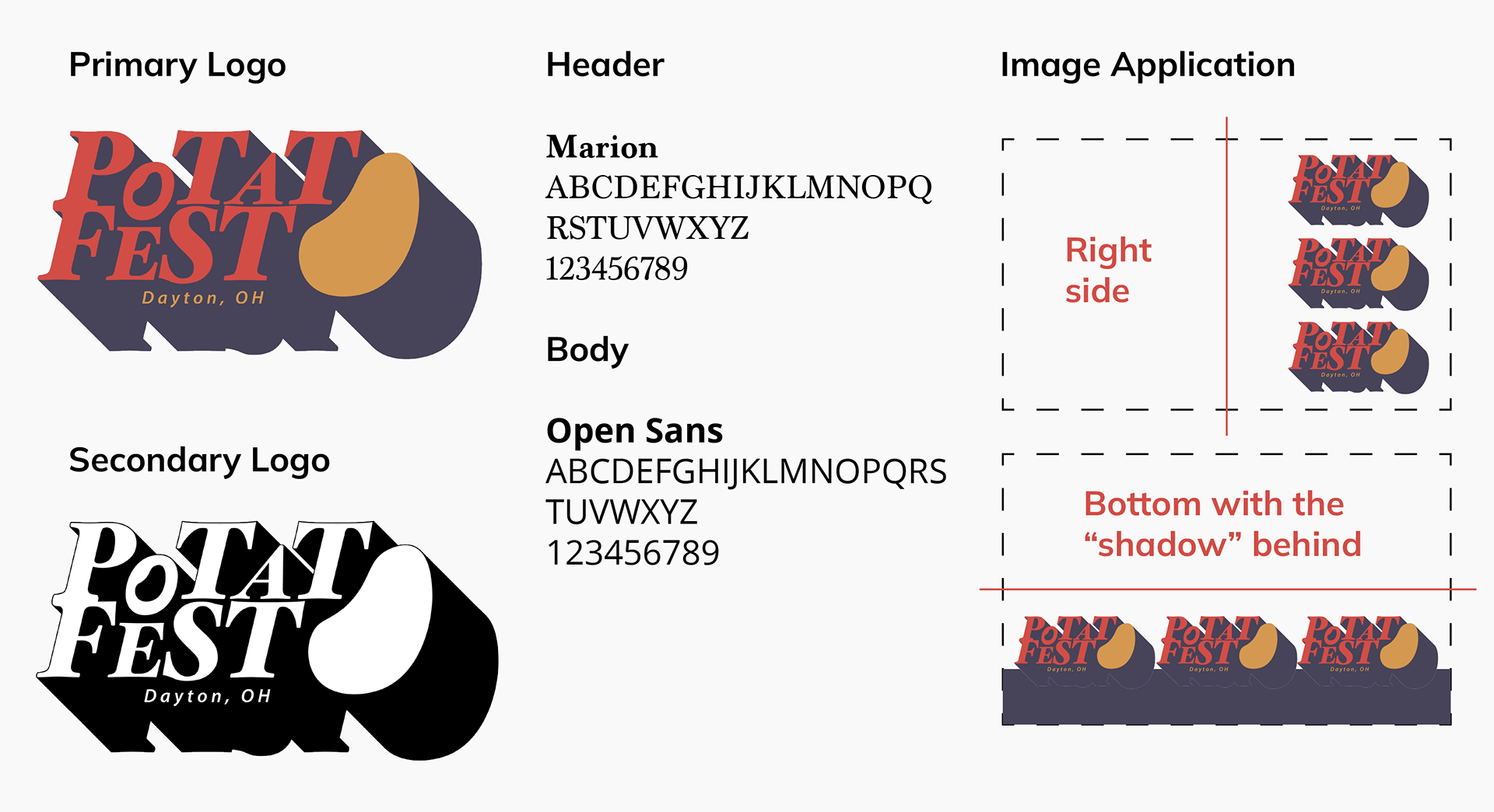
Brand identity

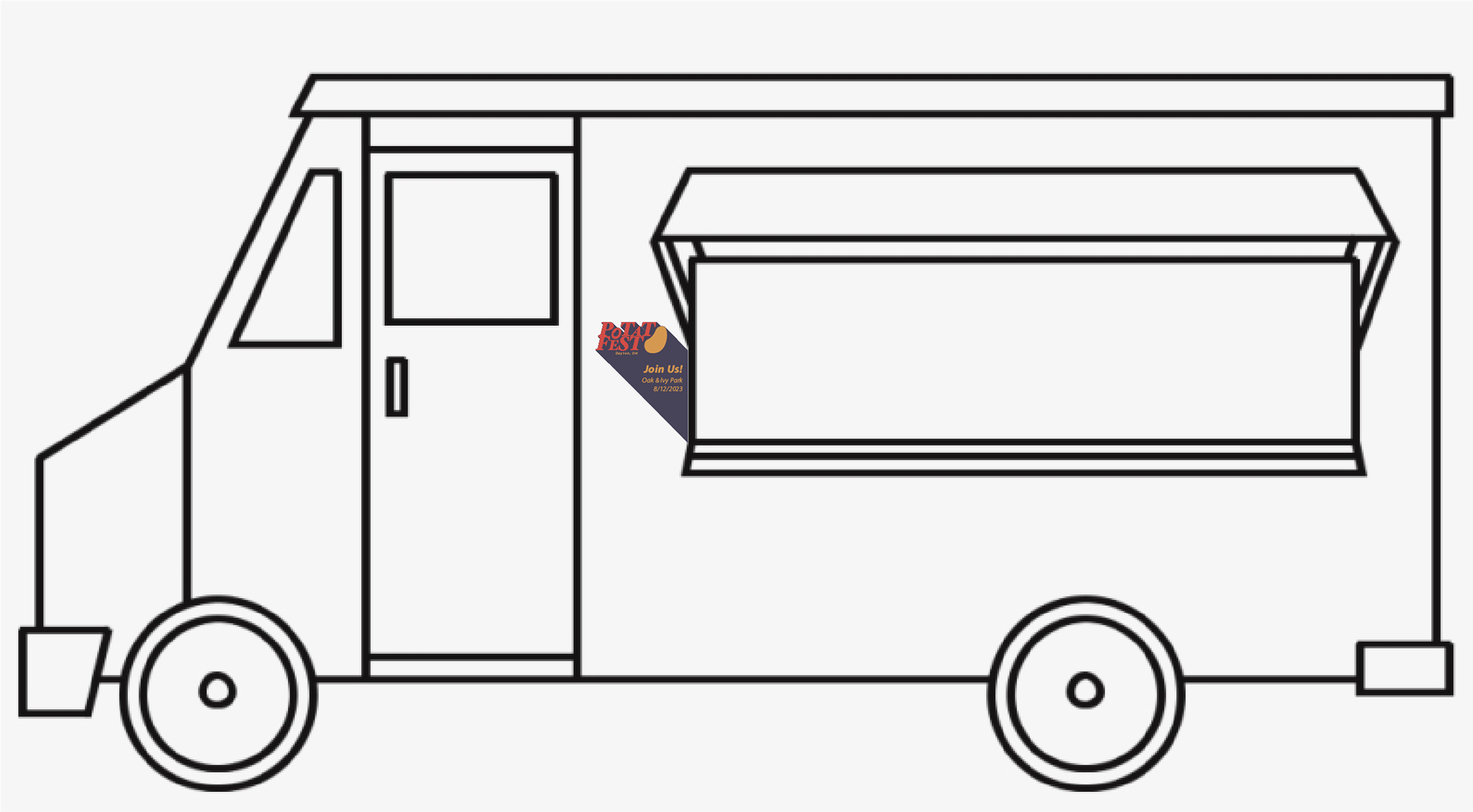
Food vendor truck magnet advertising the event
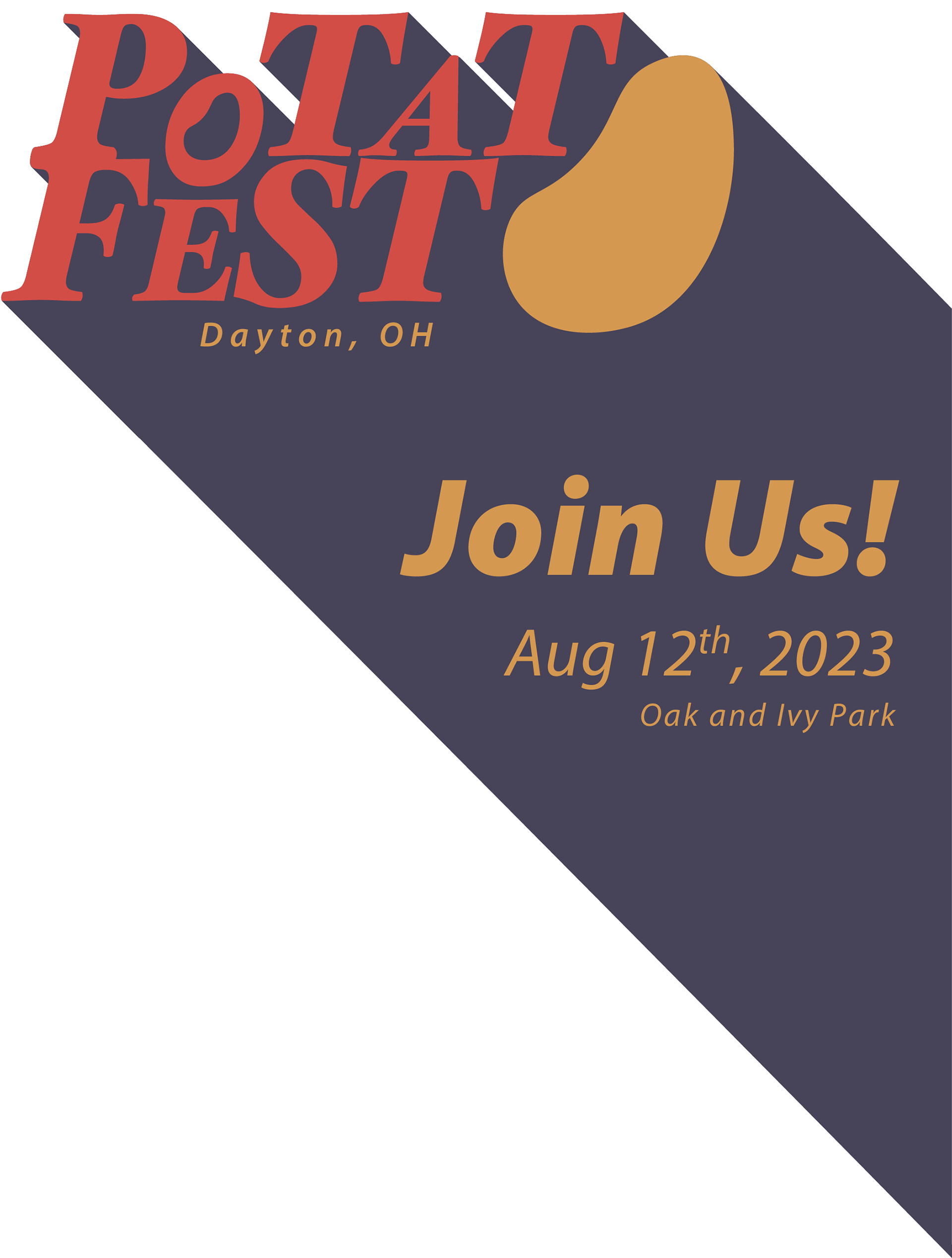
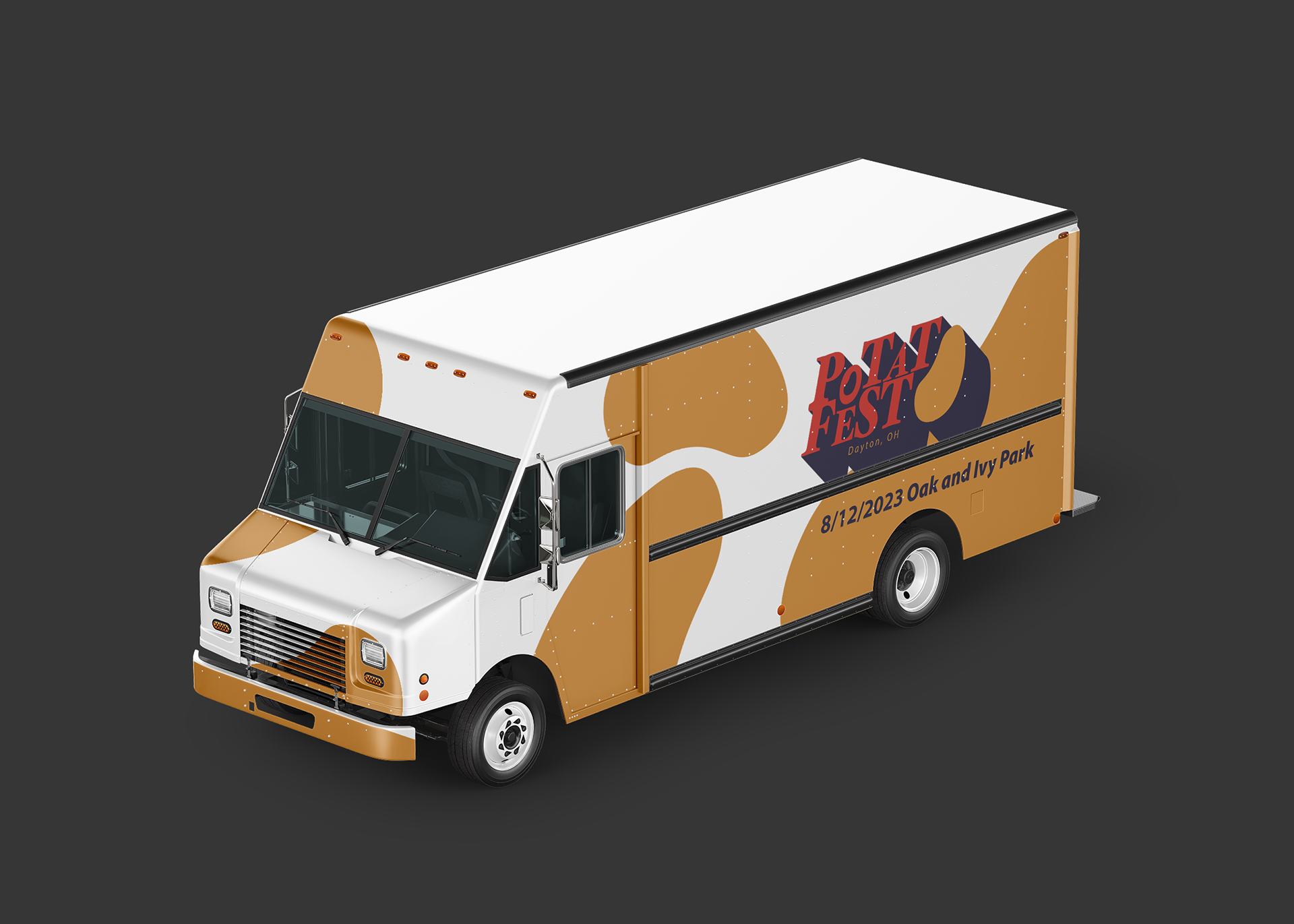
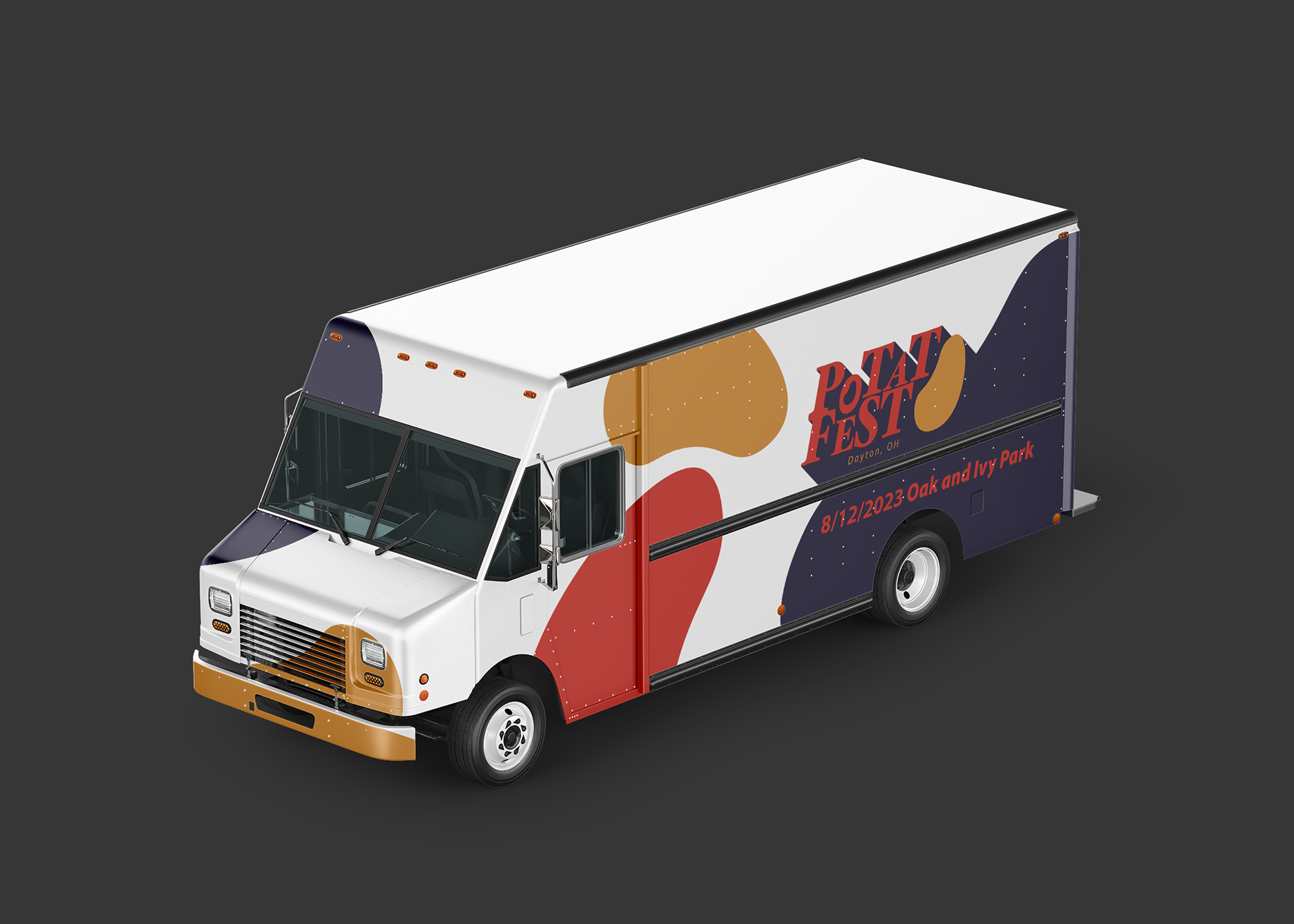
Potato Fest truck
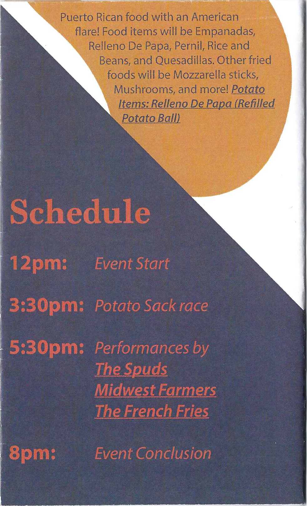
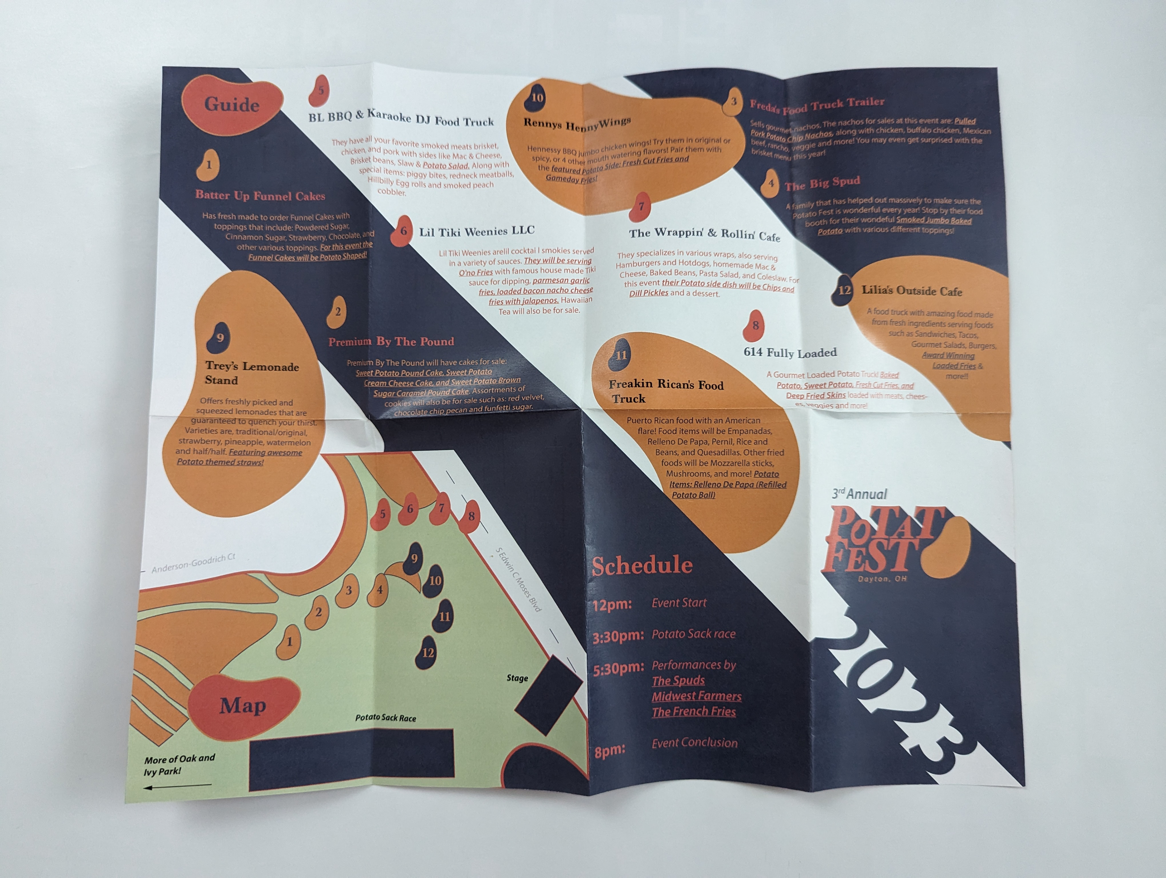
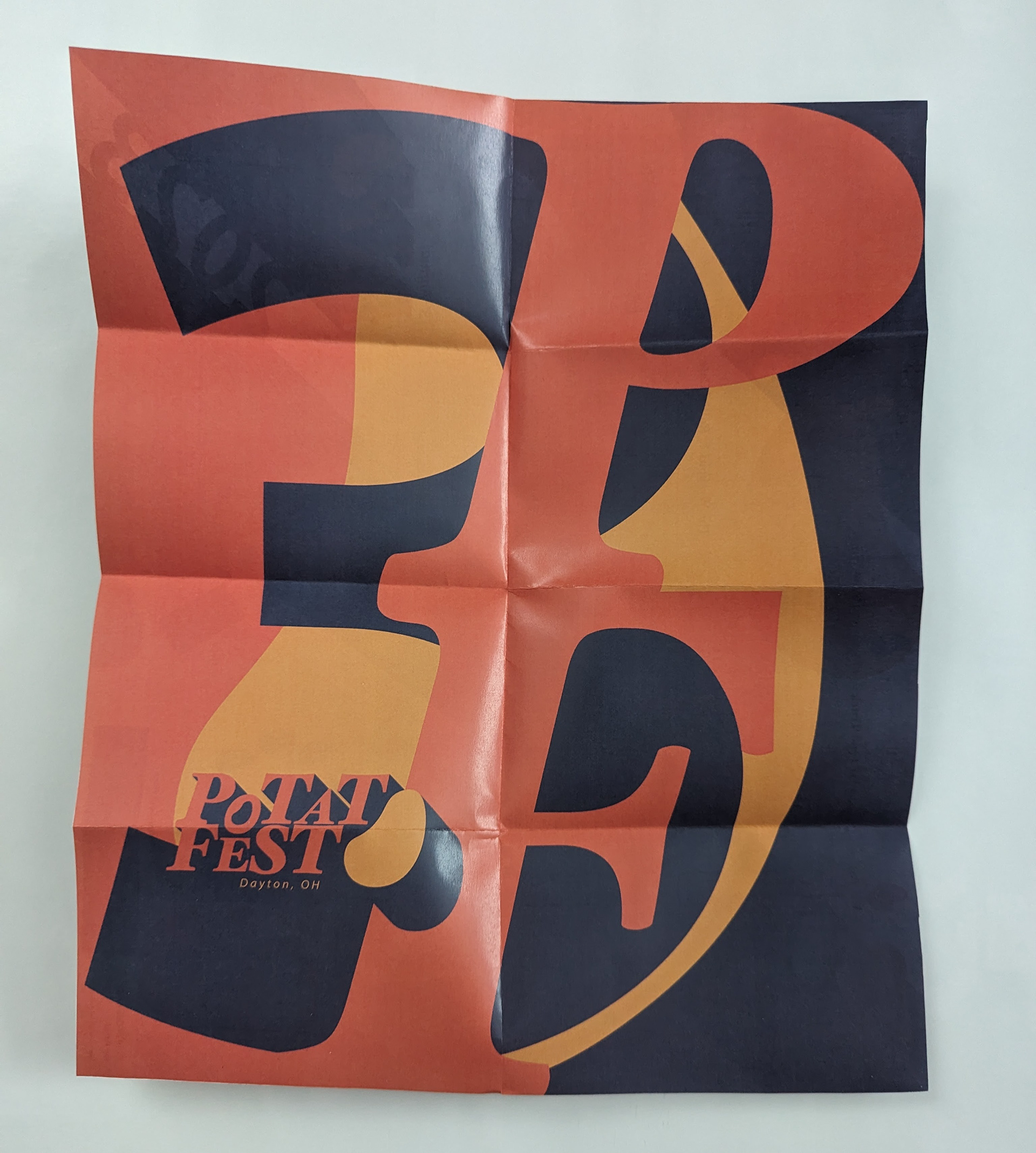
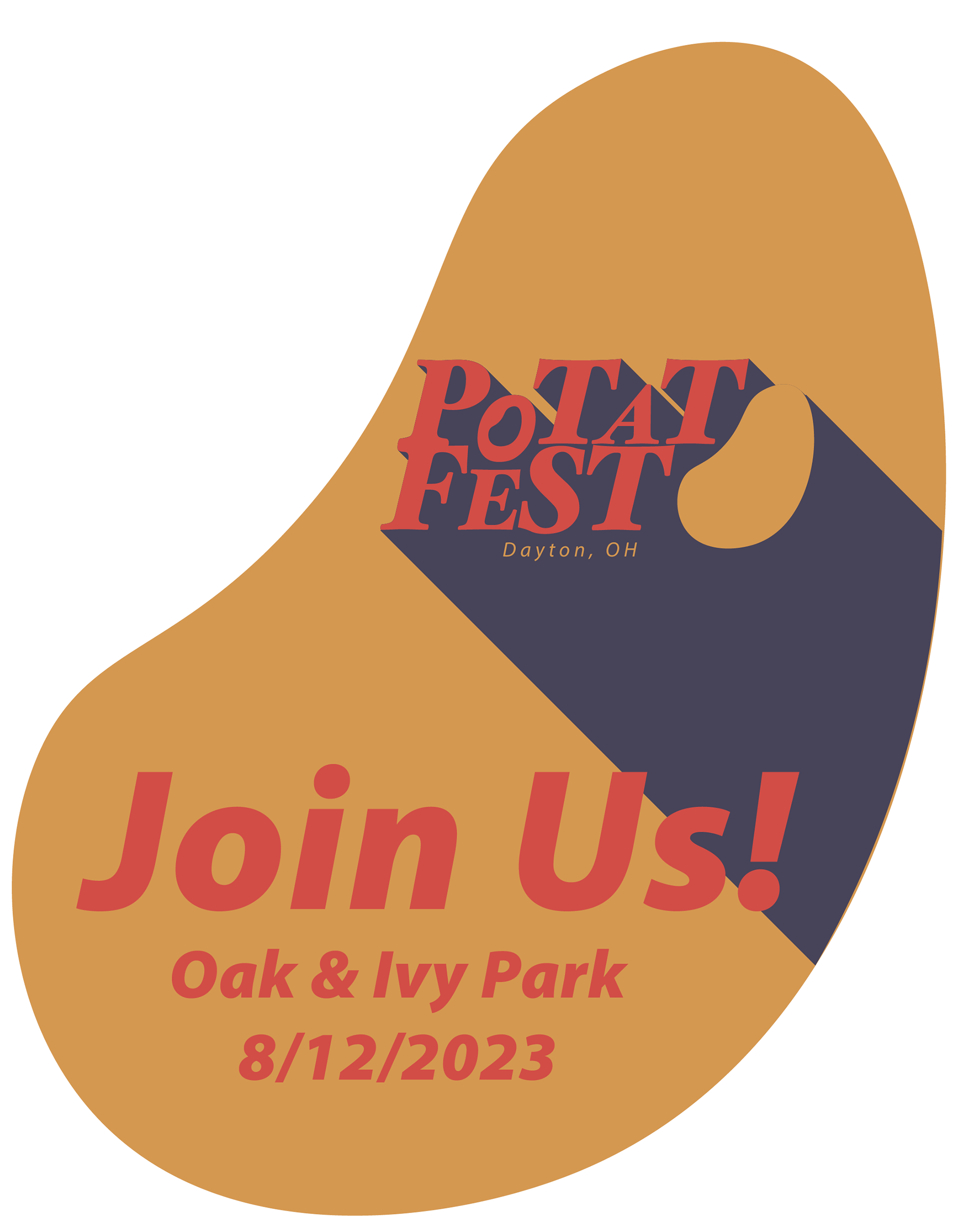
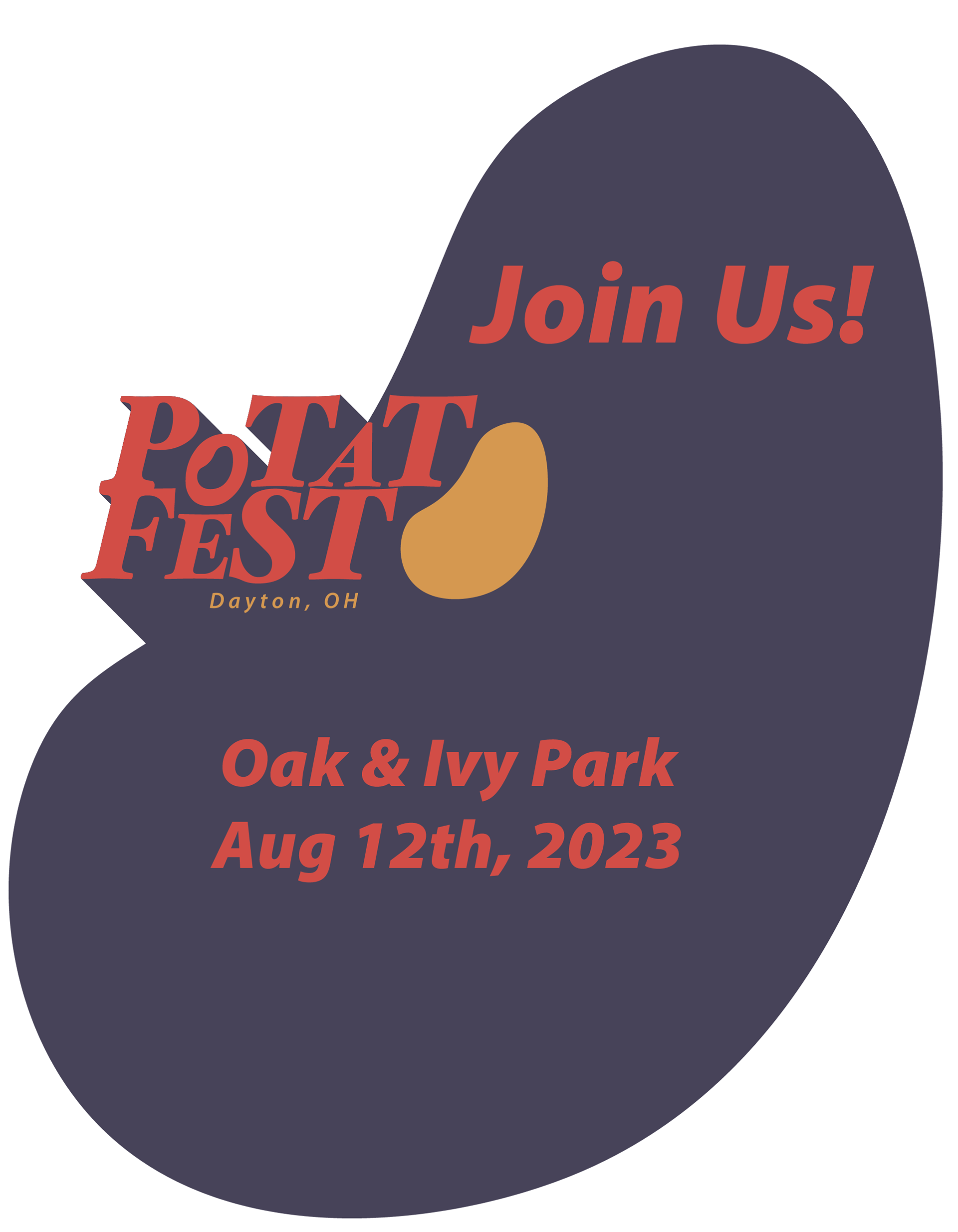
Menu / Poster