

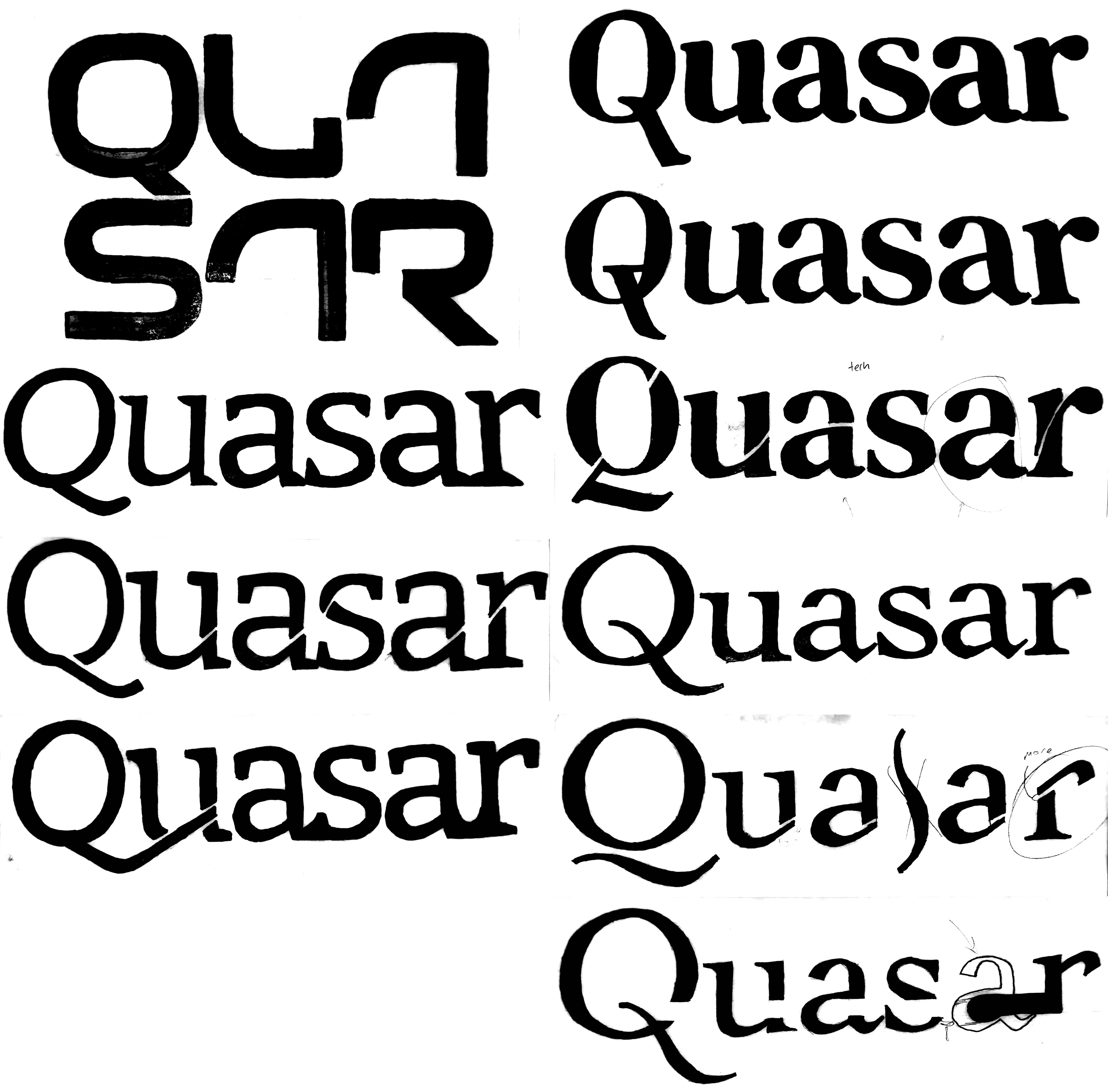
One of the main challenges was trying not to be influenced by modern day space programs like SpaceX, Blue Origin, and the Nasa "worm" wordmark, which all use sans serif typefaces. That's why I wanted to try a different approach by using typefaces with serifs and bringing the 'future' aspect to them.
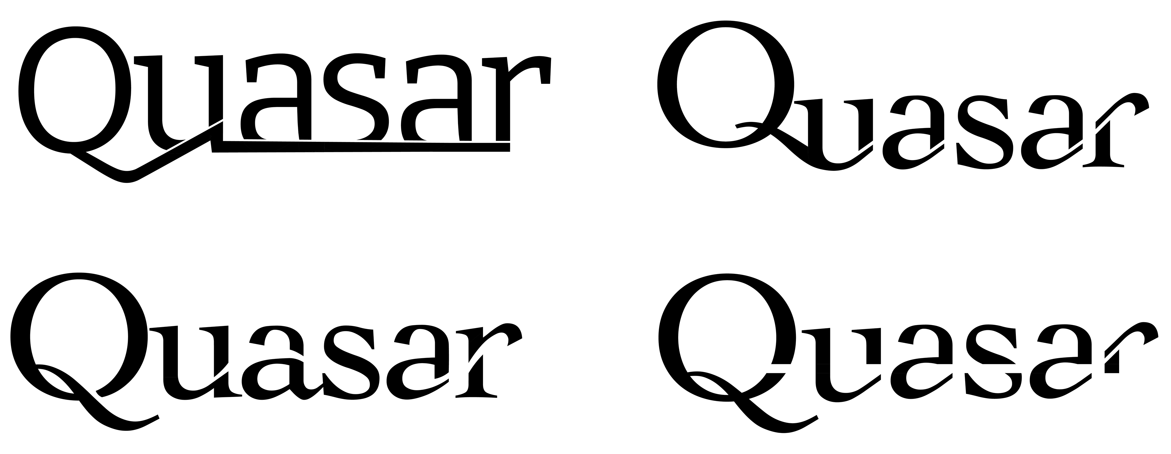
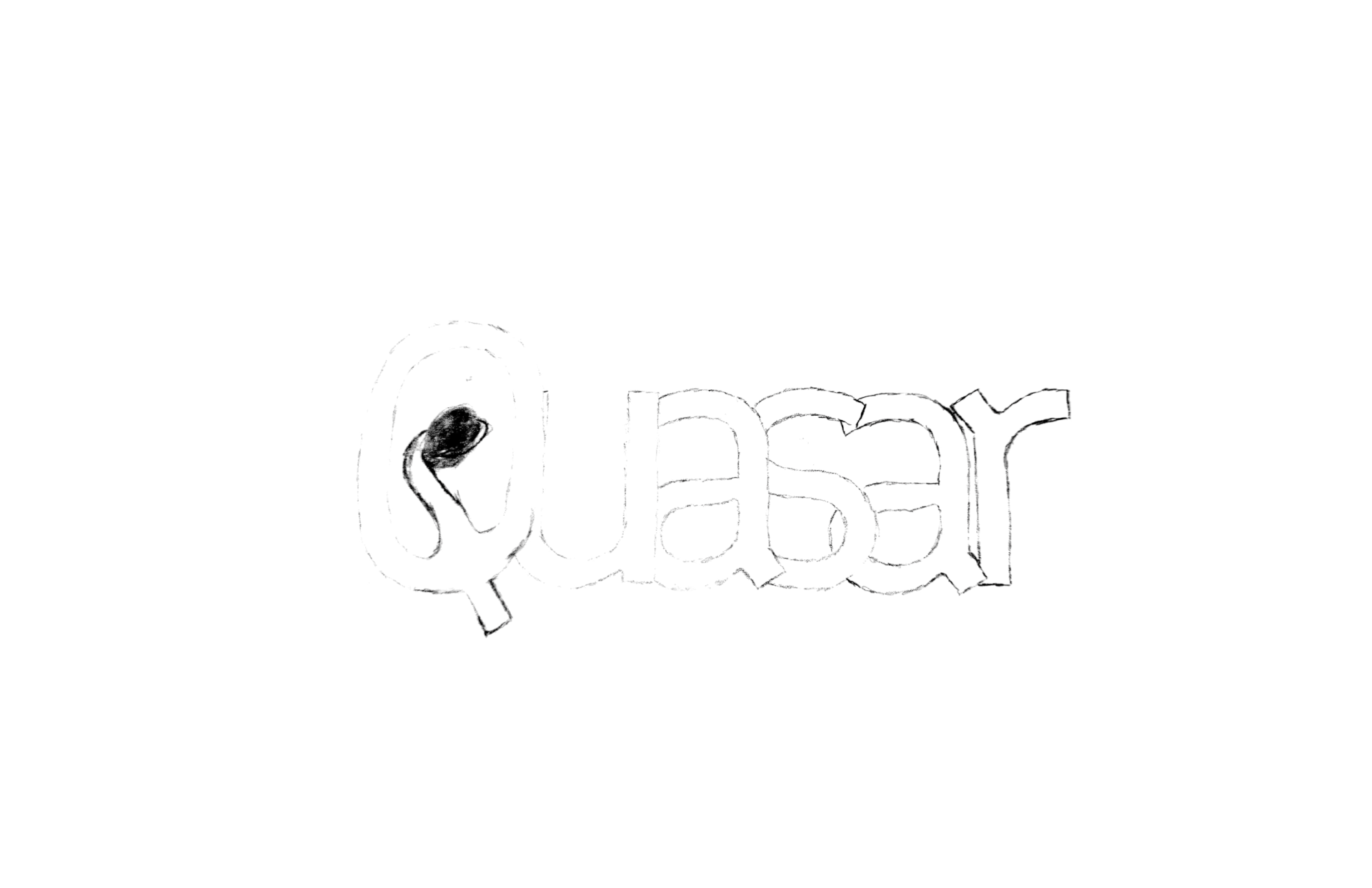
Throughout the process of refining this wordmark, I kept trying to force the continuation through the S, which you can see in a few of my sketches and digital iterations. I eventually realized that not forcefully cutting through the S was actually more effective at communicating the continuation I was going for.